
Mobile SEO: How to Optimize Your Website for Mobile Search
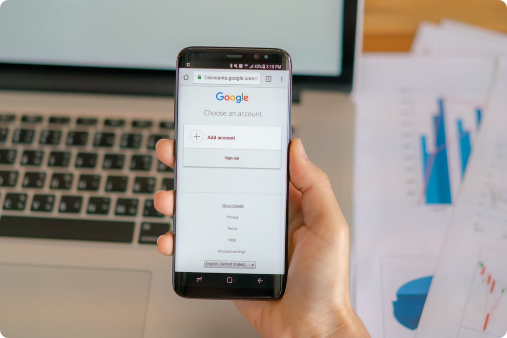
Mobile SEO is the practice of optimizing your website so it ranks and performs well for people searching on smartphones. With most searches now on mobile and Google using mobile-first indexing, your mobile experience, its speed, usability, and content, effectively decides your rankings on every device.
Google now judges your site mainly by its mobile version, so a weak mobile experience quietly caps your entire SEO. This guide from Divramis, a professional SEO company, covers mobile SEO end to end: mobile-first indexing, the right configuration, speed and Core Web Vitals, mobile usability and content, local and voice search, testing, tools, and the mistakes to avoid. Each section opens with a direct answer, then gives you the detail to act on it.
What is mobile SEO?
Mobile SEO is the practice of optimizing a website so it ranks well and works well for people searching on smartphones and tablets. It aligns content, speed, design, and usability with how mobile users read, tap, and scroll.
Mobile SEO treats the phone as the primary screen, not an afterthought. It covers technical setup, page speed, layout, and the way your content answers real questions. The goal stays simple. A visitor on a small screen should find, read, and act on your page without friction.
This discipline sits inside the wider field of organic search optimization. You still target keywords, earn links, and build topical depth. Mobile SEO adds a layer of constraints tied to the device, the network, and the way people hold a phone.
Mobile SEO works across several attributes. Each one shapes how a page performs in mobile results.
- Speed: pages should load fast on cellular networks, ideally under a few seconds.
- Layout: content must fit narrow screens without pinching, zooming, or sideways scrolling.
- Tap targets: buttons and links need enough space for a thumb.
- Readability: font sizes and line lengths stay comfortable on small displays.
- Intent: pages answer the short, urgent queries that mobile users type.
A well-built mobile site often leans on responsive web design. One flexible layout then adapts to any screen size. That single codebase keeps content consistent and helps search engines crawl every page cleanly.
Mobile SEO is not a separate channel bolted onto your site. It is the default lens through which modern search views your pages. Every heading, image, and script either helps or hurts the phone experience. Good practitioners audit each element against that mobile reality.
The entity at the center is the mobile page itself. Its attributes include load time, viewport width, tap-target size, and content depth. The values you assign to those attributes decide your outcome. A fast, complete, thumb-friendly page ranks. A slow, thin, cramped page does not.
Technical foundations carry a lot of the weight here. The viewport meta tag tells the browser how to scale the page. Compressed images and lean code keep the payload small. Clean, crawlable markup lets search engines read every section. These basics support everything else you build.
Why does mobile SEO matter?
Mobile SEO matters because most searches now happen on mobile devices. If your site frustrates phone users, you lose rankings, traffic, and sales. Search engines reward pages that serve mobile visitors well.
People reach for a phone to search in nearly every context. They look up products on the bus, compare prices in a store, and find local services on the move. A slow or clumsy mobile page pushes these visitors straight back to the results, and that hurts you.
Search engines watch how users behave. When someone taps your listing and leaves within seconds, the signal is negative. When visitors stay, scroll, and convert, the signal is positive. Strong mobile experiences feed the good signals that support higher rankings over time.
The business case is direct. Mobile traffic drives leads, calls, form submissions, and purchases. A page that loads fast and reads clearly turns more of that traffic into revenue. Below are the core reasons mobile SEO deserves priority.
- Reach: the majority of your potential audience searches from a phone.
- Rankings: search engines index and rank based on the mobile version first.
- Conversions: smooth mobile pages lift form fills, calls, and sales.
- Local demand: “near me” and on-the-go queries skew heavily mobile.
- Competition: rivals with fast mobile pages will take the traffic you miss.
Consider the cost of a single lost second. Studies across the industry link slower pages to sharp drops in engagement. On mobile, patience runs even thinner than on desktop. A visitor who waits too long taps the back button and picks a competitor instead.
Local businesses feel this most keenly. A restaurant, plumber, or clinic depends on nearby searchers who decide fast. Those users check hours, reviews, and directions from the sidewalk. A mobile page that surfaces this information quickly earns the call. A cluttered one loses it.
Mobile SEO also protects the investment you already made in content. You may write excellent guides and build strong links. Yet a broken mobile layout hides that value from most of your audience. Optimizing for phones lets your existing work reach the people who need it most, right when they search.
Ignoring mobile means competing with one hand tied. The audience is already there, on their phones, ready to act. Mobile SEO simply removes the barriers between that intent and your business.
What is mobile-first indexing?
Mobile-first indexing means Google uses the mobile version of your site as the primary source for indexing and ranking. The content, links, and structured data on your mobile pages decide how you appear in every search result.
In the past, search engines crawled the desktop version first. That approach no longer fits how people search. Google now looks at your mobile pages to understand your site, then ranks those pages for both mobile and desktop users. Your mobile version is the version that counts.
This shift makes parity essential. If your mobile pages hide text, drop links, or strip out structured data, the engine sees a thinner site. You get indexed on the weaker version, and your rankings can fall. The mobile and desktop experiences should carry the same substance.
Parity spans several elements. Each one must match between mobile and desktop so nothing valuable gets lost.
| Element | Parity requirement |
|---|---|
| Main content | Full text present on mobile, not truncated or hidden. |
| Internal links | Same navigation and contextual links available on mobile. |
| Structured data | Schema markup included on the mobile version too. |
| Metadata | Titles and descriptions consistent across both versions. |
| Images | Same visuals with matching alt text and captions. |
A responsive layout solves most parity problems by default. One set of HTML serves every device, so the mobile and desktop content stay identical. Separate mobile URLs can work, yet they demand careful checks to keep both versions in sync.
Common parity failures are easy to miss. A design might tuck secondary text behind a tab that never renders for the crawler. A mobile menu might drop links that live in the desktop footer. Each gap quietly shrinks the site that Google actually indexes.
You can check parity with a few simple habits. Compare the rendered mobile HTML against the desktop version. Confirm the same headings, paragraphs, and links appear. Test your structured data on the mobile URL. Small, regular checks catch drift before it costs you rankings.
The practical takeaway is clear. Build your mobile pages as the real, complete version of your site. When the mobile experience holds everything a visitor needs, mobile-first indexing works in your favor rather than against you.
How is mobile SEO different from desktop SEO?
Mobile SEO differs from desktop SEO in screen size, input method, connection speed, and search intent. Phones use small touch screens, slower networks, and shorter queries that often carry local, on-the-go urgency.
The screen sets the first difference. A desktop offers wide space for menus, columns, and long lines of text. A phone gives you a narrow strip. You must prioritize the most important content and let the rest fold into simple, stacked sections.
Input changes the design too. Desktop users point and click with precision. Mobile users tap with a thumb. Links and buttons need room to breathe, and forms should stay short. A cramped mobile layout leads to mis-taps, and mis-taps drive people away.
Connection speed adds another gap. Many mobile visitors browse on cellular data with variable signal. Heavy images and bloated scripts stall the page. On desktop those same assets often load without complaint. Mobile SEO forces you to trim weight and load only what the visitor needs.
Intent shifts as well. Mobile queries tend to be shorter, more local, and more immediate. Someone types “plumber near me” or “opening hours” while standing in the street. Desktop searches often run longer and lean toward research. The table below sums up the main contrasts.
| Attribute | Mobile SEO | Desktop SEO |
|---|---|---|
| Screen | Small, vertical, one column | Large, wide, multi-column |
| Input | Touch and thumb taps | Mouse and keyboard |
| Connection | Often slower cellular data | Usually stable broadband |
| Intent | Short, local, urgent queries | Longer, research-driven queries |
These differences do not split into two separate strategies. Mobile-first indexing ties them together. You optimize the mobile experience first, then confirm the desktop view stays just as strong. The best approach serves both audiences from one solid, responsive foundation.
Context of use widens the gap further. Desktop searchers often sit at a desk with focus and time. Mobile searchers move through the world with distractions all around. Your page competes with noise, motion, and a shrinking attention span. Clarity and speed win that fight.
Design patterns diverge as a result. On desktop you can spread navigation across a full menu bar. On mobile you compress it into a tidy icon or a short list. Long paragraphs that read fine on a wide screen feel like walls of text on a phone.
Focus your effort where the constraints bite hardest. Fast loading, clear tap targets, readable text, and local intent shape the pages that win on phones. Get those right, and your desktop rankings tend to follow rather than suffer.
What is the best mobile configuration for SEO?
Responsive design is the best mobile configuration for SEO. It serves one URL and one HTML file to every device, then adapts the layout with CSS. Google recommends it because it simplifies crawling, indexing, and link consolidation.
A mobile configuration defines how your server delivers pages to phones. Three main approaches exist, and each treats URLs and HTML differently. Responsive design keeps a single URL for every device. Dynamic serving keeps one URL but changes the HTML based on the user agent. A separate m-dot site uses a distinct URL, usually m.example.com.
Responsive design wins on almost every technical signal. One URL means link equity never splits across desktop and mobile versions. Search engines crawl the page once, so your crawl budget stays lean. Maintenance stays simple, because your team edits a single template rather than two parallel sites.
| Configuration | URL / HTML | Pros | Cons |
|---|---|---|---|
| Responsive design | One URL, one HTML, CSS adapts | Google’s recommended option. No content split, easy to maintain, strong link equity. | Needs careful CSS and testing across breakpoints. |
| Dynamic serving | One URL, different HTML per device | Keeps a single URL and can tailor markup to each device. | Needs correct Vary HTTP header. Errors cause wrong versions to show. |
| Separate m-dot site | Separate mobile URL | Full control over the mobile experience. | Splits signals, needs annotations, and doubles maintenance. |
The m-dot approach carries the most risk. It splits ranking signals across two domains and demands rel=”canonical” and rel=”alternate” annotations. Misconfigured redirects often send users to the wrong page. For most agencies and their clients, responsive design remains the safest and cleanest foundation.
Dynamic serving sits between the two extremes. It keeps a single URL, yet the server chooses different HTML by reading the user agent. This demands a correct Vary HTTP header so caches and crawlers know the content changes. When that header is missing, the wrong version can reach the wrong device.
Search engines index the mobile version of your pages first. So the layout a phone receives must carry your full content and metadata. With responsive design, that concern disappears, because every device receives the same source. This alignment is exactly why the responsive model has become the industry default.
How do you improve mobile page speed and Core Web Vitals?
You improve mobile speed by compressing images, caching assets, and reducing scripts. Target the Core Web Vitals thresholds: LCP under 2.5 seconds, INP under 200 milliseconds, and CLS below 0.1. Fast servers and lean code drive these gains.
Mobile networks are slower and less stable than desktop connections. So every kilobyte and every script matters more on a phone. Core Web Vitals measure the real experience users feel. Largest Contentful Paint tracks loading, Interaction to Next Paint tracks responsiveness, and Cumulative Layout Shift tracks visual stability.
Images are usually the heaviest asset on a page. Compress them, serve modern formats like WebP, and size them for the viewport. Lazy-load anything below the fold so the browser fetches it later. Strong page speed starts with disciplined media handling.
Scripts are the second common bottleneck. Heavy JavaScript blocks the main thread and delays interaction, which hurts INP. Reserve space for images and ads so the layout never jumps, which protects your CLS score. Your web hosting also shapes server response time, so choose a fast, reliable host.
Third-party tags deserve close scrutiny. Analytics, chat widgets, and ad scripts each add weight and delay. Audit them regularly and drop anything that no longer earns its cost. Loading these tags asynchronously keeps them from blocking the rest of the page.
- Compress and resize every image, and prefer WebP or AVIF.
- Enable browser and server caching for static assets.
- Minify CSS and JavaScript, then remove unused code.
- Defer non-critical scripts and third-party tags.
- Use a content delivery network to shorten distance to users.
- Reserve dimensions for media so the layout stays stable.
Each metric has a clear pass threshold you can target. Aim for LCP under 2.5 seconds, INP under 200 milliseconds, and CLS below 0.1. These numbers describe a page that loads fast, responds quickly, and stays visually steady. Missing any one of them signals a real problem for mobile users.
| Core Web Vital | What it measures | Good threshold |
|---|---|---|
| LCP | Loading of the largest visible element | Under 2.5 seconds |
| INP | Responsiveness to user interaction | Under 200 milliseconds |
| CLS | Visual stability of the layout | Below 0.1 |
Caching cuts repeat load times dramatically. When a browser stores static files, return visits skip a full download. Server-side caching also spares your database from rebuilding pages on every request. Together, these layers shave precious seconds off mobile load times.
Measure before and after every change. Tools like PageSpeed Insights and the Chrome User Experience Report show field data from real visitors. Field data matters more than lab scores, because it reflects actual devices and networks. Keep testing until all three metrics sit inside their thresholds.
How do you ensure mobile usability?
You ensure mobile usability with a proper viewport meta tag, tap targets near 48 pixels, and legible fonts of 16 pixels or more. Remove horizontal scrolling, simplify forms, and space interactive elements so fingers hit them cleanly.
Usability decides whether a visitor stays or leaves. A page can rank well yet still frustrate someone on a small screen. Start with the viewport meta tag, which tells the browser to match the device width. Without it, phones render a shrunken desktop layout that forces pinching and zooming.
Tap targets need enough size and spacing to work with a thumb. Aim for roughly 48 pixels and keep clear gaps between links and buttons. Cramped controls cause mis-taps and quickly annoy users. Body text should sit at 16 pixels or larger so nobody has to zoom to read.
Horizontal scrolling is a common and avoidable mistake. It usually comes from fixed-width elements that exceed the screen. Test every breakpoint and let content flow within the viewport. Forms deserve special care, because typing on a phone is slow and awkward.
Navigation should stay simple and reachable on a small screen. A clear menu, a visible search, and a sticky header all help. Avoid dropdowns that need precise taps or hover states that phones cannot trigger. Predictable navigation keeps visitors moving toward your goal.
- Add the viewport meta tag set to device width.
- Size tap targets near 48 pixels with clear spacing.
- Use body fonts of 16 pixels or larger.
- Remove any horizontal scrolling at every breakpoint.
- Keep forms short and use the correct input types.
- Make buttons and links easy to reach with one thumb.
Contrast matters as much as size. Text needs strong contrast against its background so it stays readable in sunlight. Buttons should look like buttons, with clear labels and obvious edges. When users can scan a page at a glance, they act with confidence.
Reduce form fields to the essentials and trigger the right keyboard for each input. An email field should open an email keyboard, and a phone field a numeric one. Small touches like these cut friction and lift conversions. Good usability supports both rankings and revenue.
How do you avoid intrusive pop-ups and interstitials on mobile?
You avoid intrusive interstitials by never covering the main content when a page loads. Google can lower rankings for pop-ups that block access on mobile. Use small banners, delayed prompts, or inline calls to action instead.
An interstitial is an overlay that sits between the user and the content. On mobile, a full-screen pop-up on arrival is especially harmful. It hides the very text the visitor came to read. Google treats these intrusive patterns as a negative signal and may demote such pages.
Not every overlay counts as intrusive, though. Legal notices, age checks, and cookie consent banners are allowed when they stay reasonable. The problem is the pop-up that dominates the screen the instant the page opens. That pattern breaks trust and damages the experience you worked to build.
The stakes are higher on mobile than on desktop. A small screen leaves little room, so a full overlay hides everything. Users cannot judge whether your page answers their query. Many simply return to the search results and pick a competitor instead.
Design your prompts to respect the reader instead. Use a slim banner that occupies a small strip of the screen. Trigger email or offer prompts after a scroll or a short delay, not on load. Inline calls to action inside the content also convert well without blocking anything.
Timing separates a helpful prompt from a harmful one. A visitor who has read half your article is warmer to an offer. A pop-up that greets them at the door is not. Waiting a few seconds, or one scroll, respects their attention and still captures interest.
Placement matters just as much as timing. Keep overlays small and easy to dismiss with a clear close button. Never trap the user behind an obstacle they cannot escape. A frustrated visitor bounces, and a high bounce rate quietly weakens your mobile performance.
Test your pages the way a real visitor would experience them. Load each one on a phone and watch what appears first. If an overlay hides your content on arrival, redesign it. Clear access keeps users engaged, protects your rankings, and turns mobile traffic into results.
How do you optimize content for mobile?
Optimize mobile content by front-loading the answer, using short paragraphs, clear headings, and plenty of white space. Small screens reward scannable structure, so lead with the point, keep sentences tight, and let readers grasp the meaning at a glance.
Mobile reading is fast and often distracted. People scan in short bursts while walking, commuting, or waiting in line. Your content must survive that context. Put the direct answer in the first sentence of every section. Then support it with brief, focused paragraphs that each carry one idea.
Long walls of text feel heavier on a narrow screen. A paragraph that looks fine on desktop can fill an entire phone view. Break it up. Aim for two or three sentences per paragraph. Use descriptive subheadings so a reader can jump straight to the part they need.
White space is not wasted space. It gives the eye rest and makes each block easier to process. Generous spacing, clear line height, and a readable font size all reduce friction. When the layout breathes, people stay longer and read more of what you wrote.
Structure also helps search engines understand your page. Clear headings map to clear topics, and answer-first writing matches how mobile users phrase questions. Cover the entity, its attributes, and its values plainly, so the meaning is obvious without extra effort.
Word choice carries weight on mobile too. Plain language beats jargon when the screen is small and the moment is brief. Define each term the first time you use it. Then reuse it consistently, so readers and crawlers never lose the thread of your topic.
Placement of the key message matters just as much. The most valuable sentence should sit above the fold, before any scroll. Treat that first screen as prime real estate. If a reader learns nothing there, many will leave before the good part arrives.
Rhythm keeps mobile reading effortless. Vary your sentence length so the text never feels choppy or heavy. A short line lands a point. A slightly longer one adds the reason. This gentle mix guides the eye and holds attention through the whole section.
- Lead with the answer. State the conclusion first, then explain it.
- Keep paragraphs to two or three sentences. One idea per block.
- Use descriptive subheadings. Let readers scan and skip to what they need.
- Prefer short sentences. Most should sit under twenty words.
- Add bullet lists and tables. They compress dense facts into scannable rows.
- Bold the key phrase. Guide the eye to what matters most.
- Leave white space. Comfortable spacing keeps readers moving down the page.
How do you optimize images and video for mobile?
Optimize media by serving responsive images, compressing to modern formats like WebP, and lazy loading below the fold. For video, favor shorter, vertical clips that load fast, respect data limits, and fit a phone screen without forcing awkward zoom.
Images are usually the heaviest part of a mobile page. A single oversized photo can double your load time. Use responsive image techniques so each device receives a size that fits its screen. A small phone should never download a wide desktop banner it will only shrink.
Format and compression matter just as much as dimensions. WebP delivers strong quality at a fraction of the file size of older formats. Compress every asset before upload, and set width and height so the layout stays stable while the page paints. Thoughtful image SEO improves both speed and rankings.
Lazy loading defers off-screen media until the user scrolls toward it. That keeps the initial view light and fast. The images at the top load first, and the rest arrive just in time. This simple technique lowers data use and improves your core loading metrics.
Video needs the same discipline. Long, heavy clips drain patience and mobile data. Shorter videos hold attention better on a phone. Vertical or square framing fills the screen naturally, since most people hold their device upright. Always add a lightweight poster image and avoid autoplay that wastes bandwidth.
Delivery method affects performance as well. Host heavy video on a dedicated player and embed it, rather than serving raw files from your own server. Streaming adapts quality to the network, so a weak connection still plays smoothly. That flexibility protects both speed and the viewing experience.
Accessibility rounds out good media. Every image needs descriptive alt text that states what it shows. Captions and transcripts make video usable without sound, which suits crowded or quiet places. These details help all users, and they also give search engines more context to index.
Test your media budget on a real device and a slow network. What feels instant on office wifi can crawl on a phone downtown. Set a size ceiling per page and stick to it. Trim, compress, and defer until the first view loads quickly every time.
How do you handle mobile on-page SEO and content parity?
Handle mobile on-page SEO by giving the mobile version the same content, internal links, titles, meta tags, and structured data as desktop. Search engines index the mobile page first, so anything hidden or trimmed on mobile effectively disappears from ranking.
Mobile-first indexing changed the rules. Google evaluates your mobile page as the primary version. If your mobile layout drops paragraphs, links, or headings to save space, it also drops the signals those elements carry. Parity is the safeguard against silent ranking loss.
Content parity means the substance matches across devices. The same body text, the same headings, and the same images should appear on both. Accordions and tabs are fine, because the content still exists in the code. Removing it entirely on mobile is the real mistake.
Metadata and links deserve equal care. Titles, meta descriptions, and canonical tags must be identical on both versions. Your internal links should also match, since they route authority and help crawlers discover pages. A trimmed mobile menu can starve deep pages of the links they rely on.
Audit both versions side by side before launch. View the mobile page as a crawler would, then compare it against desktop. Look for missing text, dropped links, or altered tags. Fixing gaps early protects rankings and spares you a painful diagnosis later.
Interstitials and pop-ups can quietly hurt mobile pages. A large overlay that blocks the content on load frustrates users and can suppress rankings. Keep prompts small and easy to dismiss. Let people reach the answer they came for without fighting through a wall.
Tap targets and readability seal the deal. Buttons and links need enough size and spacing so fingers hit them cleanly. Body text should be legible without pinch-zoom. When the page is comfortable to use, engagement rises, and those positive signals support your rankings over time.
Structured data completes the picture. Ship the same markup on mobile that you ship on desktop, so rich results stay eligible. Use the table below as a quick parity checklist before you publish.
| Element | Parity requirement |
|---|---|
| Body content | Same text and headings on both versions |
| Internal links | Identical link set, no trimmed navigation |
| Titles and meta | Matching titles, descriptions, and canonicals |
| Structured data | Same markup served to every device |
How does mobile SEO connect to local and “near me” search?
Mobile SEO powers local search because most “near me” queries happen on phones with location active. A fast, mobile-ready page with consistent business details wins visibility in the map pack, where nearby users decide who to visit or call.
People search locally in the moment of need. They want a nearby shop, a plumber, or a place to eat right now. These searches carry strong intent and often lead to a visit within hours. Mobile is the device where that intent turns into action.
The map pack sits at the top of many local results. Ranking there depends on relevance, distance, and prominence. A solid local SEO foundation ties these signals together, so your listing appears when someone nearby searches for what you offer.
Consistency is the backbone of local trust. Your name, address, and phone number must match everywhere they appear. Keep your business profile complete, accurate, and current. Add categories, hours, and photos so the listing answers questions before the user even taps through.
Reviews and ratings sway local decisions fast. On a phone, a strong star rating can win the tap before your website even loads. Encourage happy customers to leave honest feedback, and reply with care. Active, well-reviewed listings earn trust and tend to rank more prominently.
Local content on your site reinforces the signal. Create pages that name the areas you serve and the problems you solve there. Mention landmarks, neighborhoods, and services in natural language. This helps search engines match your business to nearby searches with clear local intent.
Voice and conversational queries lean local too. Spoken searches are longer and often phrased as full questions. Many of them ask for something close by, right now. Answer-first content that names the place and the service fits these queries and helps you surface in quick, hands-free results.
Speed and usability close the loop. When a mobile user taps your result, the page must load fast and show clear next steps. A tap-to-call button, a map link, and visible hours turn a search into a customer. That seamless flow is where mobile SEO and local search meet.
How do voice search and mobile SEO connect?
Voice search and mobile SEO are tightly linked, because most spoken queries happen on phones and smart speakers. People talk to their devices on the move, so mobile-friendly pages naturally capture this fast-growing search behaviour.
When someone speaks a query, they use full, natural sentences. They rarely type three clipped keywords into a box. A typed search might read “best pizza Athens”. A spoken one becomes “where can I find the best pizza near me?”. This shift changes how you research keywords and shape your content.
Optimising for voice search rewards pages that answer questions directly. Assistants read out one short reply, not a list of ten links. Your job is to become that single answer. Clear, concise responses near the top of a page win the spoken result.
Featured snippets matter here too. Voice assistants often pull their answer from the snippet that Google already trusts. So structuring content for snippets doubles as voice optimisation. Lead each section with a plain, factual reply. Then expand with detail below.
Local intent drives a huge slice of voice queries. Many spoken searches ask for something nearby, right now. A well-kept Google Business Profile feeds accurate hours, address and reviews into these results. This helps mobile users find you when they speak, not type.
To align mobile SEO with voice, focus on these traits:
- Conversational phrasing: target long, natural questions people actually say aloud.
- Question-based headings: use who, what, where, why and how in your H2s.
- Concise answers: give a direct reply in one or two short sentences first.
- Fast, mobile pages: assistants favour pages that load quickly on phones.
- Local accuracy: keep your name, address and phone consistent everywhere.
Consider how the two channels differ in practice. The table below shows the shift from typed to spoken search:
| Trait | Typed mobile search | Voice search |
|---|---|---|
| Query length | Two or three words | Full spoken question |
| Tone | Clipped keywords | Natural, conversational |
| Result shown | List of links | One spoken answer |
| Common intent | Mixed | Often local and urgent |
These differences guide your content plan. Write headings as real questions. Answer them in a sentence a person could read aloud. Then support that answer with facts, numbers and clear steps. This structure serves typed and spoken users alike.
Do not forget speed. An assistant will skip a slow page and read from a faster rival instead. Lightweight images, clean code and quick servers all help you win the spoken slot. Mobile performance and voice ranking rise together.
Voice and mobile share one goal. Both serve a person who wants a quick, trustworthy answer with minimal effort. Build for that person, and you satisfy both channels at once.
How do you test your site’s mobile-friendliness?
Test your site’s mobile-friendliness with Google’s own tools and a real phone. Google Search Console, PageSpeed Insights and Lighthouse flag technical faults, while hands-on checks on actual devices reveal problems that reports often miss.
Start inside Google Search Console. Its page experience and usability data show which URLs Google sees as hard to use on phones. You get concrete errors, such as clickable elements too close together or text that stays too small. Fix these, then request validation.
Next, run key pages through PageSpeed Insights. This tool scores loading speed on mobile and desktop separately. It reports Core Web Vitals, so you learn how fast content appears and how stable the layout feels. Each issue comes with a plain suggestion to fix it.
Lighthouse goes deeper for developers. It audits performance, accessibility and best practices in one pass. You can run it inside Chrome’s tools on any page. The report ranks fixes by impact, so you know what to tackle first.
Reports are useful, yet they never replace real hands. Open your site on several phones and tablets. Try an older Android device and a modern iPhone. Tap the buttons, fill a form, scroll a menu. You feel friction that no automated score can capture.
Use a mix of methods for full coverage:
- Google Search Console: review mobile usability and page experience reports for flagged URLs.
- PageSpeed Insights: measure mobile loading speed and Core Web Vitals per page.
- Lighthouse: run a full audit for performance, accessibility and best practices.
- Real devices: browse your site on actual phones to test taps, forms and menus.
- Browser emulators: use responsive mode to preview many screen sizes quickly.
Pay close attention to touch targets and readable text. Buttons need enough space so fingers do not mis-tap. Body text should stay legible without pinch-zoom. Forms must be short and easy to complete on a small screen. These small details shape how users judge your site.
Check speed on a real mobile network too. Many owners test only on office wifi, which hides the truth. Switch your phone to a normal data connection and load a few pages. A page that feels fast on wifi can crawl on a weaker signal.
Test after every major change, not just once. A new plugin, a heavy image or a fresh template can quietly break the mobile view. Regular checks keep small faults from turning into lost rankings and lost visitors.
What tools help with mobile SEO?
The best mobile SEO tools combine Google’s free diagnostics with paid audit platforms. Google Search Console, PageSpeed Insights and Lighthouse cover speed and usability, while Semrush, Ahrefs and Screaming Frog crawl the whole site for deeper issues.
Google’s free tools form your foundation. Search Console reports how real users and crawlers experience your pages. PageSpeed Insights and Lighthouse measure speed, layout stability and technical health. Together they cost nothing and give trustworthy, first-party data straight from Google.
Paid platforms add scale and context. Semrush and Ahrefs run full site audits that flag hundreds of issues at once. They spot broken links, slow pages, thin content and missing tags. Both also track how your mobile rankings move over time against rivals.
Screaming Frog handles the technical crawl. It behaves like a search engine bot and walks your entire site. You quickly find redirect chains, duplicate titles and orphan pages. For large sites, this crawler saves hours of manual checking.
Choose tools by the job you need done:
- Google Search Console: monitor mobile usability, indexing and real search performance for free.
- PageSpeed Insights and Lighthouse: diagnose speed, Core Web Vitals and technical faults per page.
- Semrush: run broad site audits and track mobile keyword positions.
- Ahrefs: audit technical health and study competitor mobile visibility.
- Screaming Frog: crawl the whole site to surface structural and on-page errors.
No single tool does everything well. Google’s suite tells you how visitors feel your speed and usability. The crawlers and audit platforms tell you why problems exist across many pages. Pair them, and you see both the symptom and the cause.
Match each tool to its main strength. Search Console shines at real-user and index data. PageSpeed Insights and Lighthouse excel at speed and Core Web Vitals. Semrush and Ahrefs lead on broad audits and rank tracking. Screaming Frog owns the deep technical crawl.
Budget also shapes your choice. The Google tools are free and cover most small sites well. A growing business gains from one paid platform that watches rankings and audits health each week. Start free, then add power only when the site truly needs it.
Keep your toolkit lean and consistent. Pick one free diagnostic set and one audit platform, then use them on a fixed schedule. Steady, repeatable checks beat a random pile of tools you rarely open. Over time, this discipline keeps your mobile SEO strong.
How do you measure mobile SEO performance?
You measure mobile SEO by tracking the mobile segment on its own: mobile organic traffic, mobile keyword rankings, mobile Core Web Vitals, mobile usability in Search Console, plus mobile bounce, engagement and conversions compared against desktop.
Google indexes your site with a smartphone crawler. So the mobile experience is the ranking baseline, not a side view. Your reporting must reflect that reality. Split every metric by device and read the mobile numbers first.
Start with mobile organic traffic. In Google Analytics, filter sessions by the mobile device category. Watch how mobile sessions trend week over week. Then compare the mobile share against desktop for the same pages. A healthy site often draws most of its visits from phones.
Next, track mobile rankings separately from desktop. Rank trackers let you set a mobile crawl profile, and the positions frequently differ. Google Search Console makes this simple. Open the Performance report, then filter by the Mobile device tab.
Google Search Console is the core of mobile measurement. Use these reports on a regular schedule:
- Performance, Device = Mobile: clicks, impressions, average position and click-through rate for phones only.
- Core Web Vitals report: the Mobile tab groups URLs as Good, Needs Improvement or Poor. It scores Largest Contentful Paint, Interaction to Next Paint and Cumulative Layout Shift.
- Page Experience: the share of mobile URLs delivering a good experience over time.
- Index coverage: confirms the mobile crawler reaches and indexes your pages.
Core Web Vitals deserve their own attention. Field data from real Chrome users is what Google actually weighs. Aim for LCP under 2.5 seconds, INP under 200 milliseconds and CLS under 0.1. Pair the field report with lab tools like Lighthouse or PageSpeed Insights, and always run those in mobile mode.
Engagement metrics tell you whether phone visitors stay. Compare these signals across devices:
- Bounce rate: a mobile figure far above desktop points to layout, speed or content friction.
- Engaged sessions and engagement time: short mobile sessions hint that content or navigation frustrates thumbs.
- Pages per session: weak internal linking on small screens drags this number down.
- Scroll depth and event tracking: these show how far users read and which elements they touch.
Read these numbers as a device gap, not an absolute. Desktop and mobile users behave differently, so the story lives in the difference. When mobile trails desktop on the same page, that page needs work.
Conversions close the loop. Set up device-segmented goals for form fills, calls, add-to-carts and purchases. A mobile conversion rate well below desktop usually signals friction: tap targets that miss, forms that fight the thumb, or checkout steps that stall. That gap is money you can recover. Track it every month, and watch how each fix moves the mobile rate.
Build one dashboard that puts mobile and desktop side by side. Segment traffic, rankings, Core Web Vitals, engagement and conversions by device in the same view. When mobile lags on any row, you know where to dig. A structured SEO audit ties these signals together and turns scattered numbers into a fix list.
What are the most common mobile SEO mistakes to avoid?
The most common mobile SEO mistakes are content parity gaps, slow pages, intrusive pop-ups, tiny tap targets and text, blocked resources, unplayable content, horizontal scrolling, skipping real-device testing, and ignoring local intent.
Each mistake below either weakens rankings under mobile-first indexing or drives phone visitors away. Most are easy to spot once you look for them. Fix them in order of impact, and re-test after every change.
- Content parity gaps between mobile and desktop. Google ranks your mobile version. If the phone page hides text, headings, images, structured data or internal links that desktop shows, you lose ranking signals. Serve the same primary content on both.
- Slow mobile pages. Heavy images, render-blocking scripts and bloated code stall load on cellular networks. Compress and lazy-load images, defer non-critical JavaScript, and cache aggressively. Speed lifts both rankings and conversions.
- Intrusive pop-ups and interstitials. A full-screen overlay that buries content on arrival frustrates users, and Google can demote pages that use them. Keep interstitials small, easy to dismiss, and away from the first interaction.
- Tiny tap targets and text. Buttons and links crammed together cause mis-taps. Give tap targets at least 48 pixels of space and keep body text near 16 pixels. Thumbs need room, and eyes need legible copy without pinch-zoom.
- Blocked resources. Disallowing CSS, JavaScript or image files in robots.txt stops Google from rendering the page as a user sees it. The crawler then misjudges layout and content. Let the mobile bot fetch every resource it needs to render.
- Unplayable or incompatible content. Flash and other legacy formats do not run on phones. Video that lacks a mobile-friendly player leaves a blank hole. Use open web standards and responsive embeds so media plays everywhere.
- Horizontal scrolling. Fixed-width elements, oversized images and wide tables push content beyond the viewport. Users then swipe sideways to read, which feels broken. Use responsive units and wrap wide tables in scrollable containers.
- Not testing on real devices. Emulators miss touch behavior, network lag and how a page feels in the hand. Check pages on actual phones across screen sizes and connection speeds. Real-device testing catches problems that a desktop preview hides.
- Ignoring local intent. Many mobile searches carry “near me” or on-the-go purpose. Neglecting your Google Business Profile, NAP consistency, local landing pages and click-to-call loses ready buyers. Treat local optimization as core mobile work, not an add-on.
These mistakes rarely travel alone. A slow page often hides blocked resources. A parity gap often comes with an aggressive pop-up. Audit the mobile experience as a whole, not one metric at a time. One overlooked issue can mask several others, so fix and re-test in loops.
Prioritize by user impact and search visibility. Fix content parity and blocked resources first, because they touch indexing directly. Then attack speed, tap targets and pop-ups, which shape engagement and conversions.
Mobile SEO is a continuous discipline, not a one-off project. Phones, networks and Google’s signals keep shifting. Measure the mobile segment on its own, avoid the mistakes above, and revisit both on a steady cadence. Do that, and your site earns durable visibility where most of your audience already searches, taps and buys.
Frequently asked questions about mobile SEO
Is mobile SEO different from regular SEO?
Mobile SEO is part of regular SEO, not a separate discipline, but with extra focus on the mobile experience. Because Google uses mobile-first indexing, your mobile site’s speed, usability, and content now drive your rankings on all devices, so mobile gets special attention.
The fundamentals are the same; mobile SEO just makes sure those fundamentals work perfectly on a phone.
What is mobile-first indexing?
Mobile-first indexing means Google uses the mobile version of your site to crawl, index, and rank it. If your mobile pages have less content, fewer links, or missing structured data than desktop, your rankings will reflect that weaker mobile version.
The fix is content parity: make sure your mobile site includes everything important that your desktop site has.
Does mobile speed affect SEO?
Yes, mobile speed is a direct ranking factor through Core Web Vitals and page experience. Slow mobile pages frustrate users and increase bounce rates, so improving load time usually lifts both rankings and conversions on mobile.
Focus on fast hosting, compressed images, caching, and lean code to keep your mobile pages quick.
What is the best mobile configuration for SEO?
Responsive design is the best and Google-recommended configuration for mobile SEO. It serves one set of HTML that adapts to any screen, keeps a single URL, and avoids the content-parity and duplicate-content risks that come with separate mobile sites.
Unless you have a strong reason otherwise, choose responsive design over dynamic serving or a separate m-dot site.
Conclusion
Mobile SEO is no longer optional; it is how Google sees your entire site. By using responsive design, making your pages fast and easy to use on a phone, keeping full content parity, and optimizing for local and voice search, you give every visitor, and every ranking, a mobile-ready foundation.
Start with a responsive, fast, usable mobile experience, ensure your mobile pages match desktop in content and structure, and test on real devices. Monitor your mobile performance in Search Console, fix the common mistakes, and mobile SEO becomes a durable advantage in a mobile-first world.
Request an SEO Quote Today!
You can subscribe to our newsletter if you want to learn more about us and get on the first page of Google.

I am Yannis Divramis, I am an SEO Expert. I have been doing SEO since 2013.
I run the Divramis SEO Agency, and I am very glad that you’ve watched this video and keep watching the other videos, because we are posting many videos about SEO every month.
We are specialized in Escorts Agency SEO, adult SEO, Roofers SEO and many other verticals.
So, if you run a website and want to rank higher in Google, you can ask now for a website promotion offer and get a quote from us.
Ask now for a website promotion offer
See more about SEO
- 11 DIGITAL MARKETING TIPS FOR EVERY BUSINESS AND WEBSITES
- START UP SEO FROM ZERO TO HERO
- SEO 2020: The Best Guide for Ranking in Google
- SEO Reseller Services
- How to Make a YouTube URL that Auto Subscribes to Your Channel
- 5 Things To Do Before Designing A Site On WordPress
- 7 Reasons your eshop needs a blog to survive
- Organic Search Audit
- How to rank you site on Google – A Starter’s Guide
Hey JOHN…
When your website has an old or obsolete web design, and it is not possible to redesign it from scratch, you should at least use friendly practices for mobile devices.
Having optimized content for mobile devices is still useful for those looking for ways to get better results in mobile search.
Having fast-loading content is still useful for those looking for ways to get better results for users of mobile and desktop devices.As always, the classification uses many factors. We can show content to users that is not compatible with mobile devices or that is slow to load if our many other signals determine that it is the most relevant content to display. I have really enjoyed your shared nice piece of content with us. .. Actually, can you give an idea to design and develop a mobile comparison website but know, its not an easy job to collect mobiles data. A lot of time and cost is required to build such a website and I don’t want to spend a lot of money as I am new in this field. My colleague has recommended me RevGlue for this purpose as this a uk base registered company and are providing mobiles and its deals data for UK only with the name of RevEmbed technology as I have read its blog revglue.com/blog-detail/13-setup-free-uk-mobile-comparison-website but I am a little bit confused as its a newborn company. Anyone, have experience with RevGlue. Guide me guys in this respect. Waiting for your kind response. Thanks in advance.
Thanks for sharing all of your experiences!